Tutor: Andrew Farrington
Brief/Learning Outcomes assessed in this assignment:
- Appraise the role of the editorial photographer and the range of contexts within which they work.
- Produce photographic imagery using relevant techniques and processes utilised by editorial photographers.
- Utilise technologies designed for the sharing of editorial images.
- Evaluate legal and moral restrictions imposed upon news and editorial photographers.
- Use captions and metadata to assist editors in the identification of the image's ownership and background.
Task:
Students will be able to choose from the following topics; news, photojournalism, photo-essay, editorial fashion and garment, features photography, sports, performance and travel. Students will be required to present their work as a portfolio of photographic imagery and as short written study (specifically regarding ethics, rights and copyright appropriate to the students' interest). Moving image and other 'convergence' image media relevant to the sector will be eligible for submission as part of the student's portfolio response.
Considerations:
Historical and contextual; social, geographical, political issues covered by editorial photography.
Types of editorial photography; photojournalism, press, social, documentary, reportage, speculative, commissioned, editorial work.
Brief restrictions; timescale, constraints, age/gender/ethnicities affecting the role of the photographer.
Image transfer (email, FTP, wire transfer etc).
Caption writing, image description, 'orphans', IPTC and metadata
Legal restraints; copyright permission, image-editing ethics, rights of the photographer (public/private space), Press Complaint Commission, Government Acts
Assessment Criteria:
1. Depth of research and understanding of the role of the editorial photographer, the variety of editorial approaches, styles and contexts for which it is made.
2. The quality of the images produced for the brief including consideration to style, the choice of images in relation to the context, the message being communicated, technical proficiency.
3. Level of awareness of and confidence in using technologies designed for the sharing of editorial images.
4. Ability to identify (in your evaluations) how legal and moral restrictions relate to your own processes practical outcomes.
5. Ability to write and attach suitable captions and instructive metadata to your images in order to indicate their ownership and background for a relevant third party.
_______________________________________________________________________
What is Editorial?
To begin the module, we were all asked for our own opinions on what
the word 'editorial' means. After doing some research, this was my initial
understanding of the word:
In its simplest form, editorial is used in a variety of fields
and is generally understood as a published piece of information or opinion that
is written by an editor or writer to be viewed by the public. In the field
of photography, editorial is imagery that isn’t taken for commercial or
advertising purposes. It is usually a relevant accompaniment of a text in a
newspaper or article to attract the reader and support the written word, for
example, the cover of a magazine. This type of photography can be difficult to
define as there seems to be crossovers of it’s meaning to many people and it is
also not exclusive to one field of photography as it can apply to
photojournalism, landscape work, portraits, sports photography and fashion,
among others. From what I understand, the newspaper or magazine that the
photography appears in finances editorial photography, not the advertisers.
Through research, I have discovered that editorial photography is generally not
very well paid but allows the photographer much more scope for creativity.
This, in turn helps the photographer to build up a good portfolio, which will
make them more likely to gain higher paid job opportunities.
Examples of editorial photography:
Photographer: Aaron K
Project: Beauty editorial in bulletmag.net - 'In The Pink'
Thoughts: The simplicity of the setting adds real prominence on the colour in question. I also feel that the model's expressions and body language, along with the high key lighting creates a dramatic mood which is conveyed through the photographs.


The following editorial photographer's portfolios have been chosen from this list of editor's picks from photo.net. In viewing these portfolios, I have gained a better understanding of the typical editorial style and way of composing my images.

Photographer: M. H.
- Began professional photography 17 years ago with Journalism/Editorial photography.
- Winner of multiple national and international awards in editorial/fashion/fine art/war journalism photography.
- User of only film photography without digital enhancements
- Shoots in only natural light or available light (except from specific studio projects)


- Born in south-eastern Poland in February, 1984.
- Began adventure with photography at the age of 22
- Hobby developed into passion and way of living.
- Self-taught photographer fascinated with people, portraits and fashion photography.
- Online gallery at www.joannakustra.com
Joanna Kustra is the most inspiring photographer I have looked at so far in this module. Whatever the theme, her incredible images show someone who truly considers every aspect of the image, from capturing the best of her subjects to careful organisation of colour. She executes lighting techniques perfectly, whether shooting with shadows or high key. Her post-production is outstanding, with a theme of contrasting and muted tones that match her colour curtain backgrounds throughout her portfolio. Below are my favourite images from most of the sets on her photo.net portfolio:
'Colour':


'Misty Dream':


'The Olympians':
Fashion editorial honouring the 2012 olympics for Papercut Magazine.


'Brides & Widows':


'Paintings':


'B&W':


'Wild Voyage':


'White':


'Colour':


'Children Salon':


'Bohema':


'Innocence':


'Simple beauty':


'Shadow':


TASK: Phobias
pho·bi·a/ˈfōbēə/
Noun
|
The first practical task we were given was on phobias. We were asked to think of our own phobia(s) and respond photographically. My personal phobia is one that I have suffered from for years - emetophobia. Emetophobia is an intense, irrational fear/anxiety of vomit or vomiting.
I wanted to try and photographically portray this phobia in a way that meant I wasn't being too literal. This is why I started thinking of the physical effects that a phobia, anxiety or fear can have on a person. Though the last image in this small set makes it visually clear on what my phobia is, the others were my attempt at documenting the physical changes that happen and state of mind I am in during these times of anxiety - dilated pupils/widened eyes, perspiration and feelings of tension and panic.
I wanted to try and photographically portray this phobia in a way that meant I wasn't being too literal. This is why I started thinking of the physical effects that a phobia, anxiety or fear can have on a person. Though the last image in this small set makes it visually clear on what my phobia is, the others were my attempt at documenting the physical changes that happen and state of mind I am in during these times of anxiety - dilated pupils/widened eyes, perspiration and feelings of tension and panic.


TASK: Signs of the Times - 25 Years On
Objectives:


TASK: Developing Styles
Objectives:
Chosen image:

My interpretation:


http://www.lighting-essentials.com/shoot-thru-umbrella-and-bounce-umbrella-a-comparison/
Editorial article idea
MORALS/RIGHTS/SENSITIVITIES
http://www.the-aop.org/information/copyright-4-clients/faqs
RELEVANT RESEARCH
http://www.bbc.co.uk/news/world-africa-25330672
http://www.foxcrawl.com/2013/12/14/fake-deaf-and-dumb-translator-next-to-barack-obama-at-mandela-funeral-sign-language-interpreter-is-an-imposter-with-criminal-record/
http://limpingchicken.com/2013/12/17/deaf-news-scandal-of-deaf-man-treated-as-if-he-had-dementia-in-hospital/
http://en.wikipedia.org/wiki/Legal_recognition_of_sign_languages
ARTICLE SOURCES
http://www.tate.org.uk/art/artists/sir-joshua-reynolds-444
https://www.tate.org.uk/art/artworks/reynolds-self-portrait-as-a-deaf-man-n04505
My chosen final images


My Editorial article

- To choose one caption from a list of quotes which have been taken from a photo-book published in Manchester 25 years ago.
- Shoot a series of 4-6 images which reflect my understanding of the caption.
- To avoid looking at the book or it's photographs, as doing so could alter my perception of the caption.
- Through images, try to define our present, 25 years on from when the book was published.
"It's important I suppose to preserve a little bit of old England."
I have gone with this particular quote because it instantly gives me a mental picture of what I might like to photograph. As it is quite vague or loose in description, I feel that it will allow me to approach it from various ways. For example, taking the quote directly and shooting what I see to be preserving 'old England', or responding with photographic sarcasm. I have decided to go with the latter (in true British fashion) and photograph aspects and habits of every day life, next to old traditions and customs to reflect the change which many would say is not for the better.


TASK: Developing Styles
Objectives:
- To view all images at http://www.hongkiat.com/blog/50-great-photographers-you-should-know/
- Select one of these and recreate it, focusing more on the editing style than the subject matter.
After viewing all of the images, I noticed that a lot of these were very intricately and professionally post-processed. As I am not very knowledgable in the field of post-processing, I wanted to choose an image that was not hugely unrealistic for me to achieve in recreating, but that would still challenge me and give me elements to consider that I hadn't before and stepping slightly out of my 'comfort zone' with regards to shooting style. I felt that it would also give me an opportunity to experiment and have a trial and error session with studio lights, something I am also not well practiced in. This helped me to decide on a portrait by Alessandro Rocchi - commercial and art photographer. The chosen image is one from a small series entitled 'Auch!', which translates as 'also'. The series consists of close-cropped portraits of people biting their lips. The lighting is high-key and what could be considered as unflattering on the subjects. There is also a beautiful catch light which is most likely down to the use of a ring flash. The lighting I used was basic - a white shoot-through umbrella directing facing and on eye level with the subject. The catch light effect I definitively wanted to recreate was something I struggled with, due to not having the right type of lighting. In post-production, I increased clarity to it's maximum level to define the facial features and attempt to unflatter the subject, slightly altered the tint to increase the green tones, cropped in tightly on the face, reduced shadows under the eyes and finally, vignette as unlike Alessandro Rocchi's images, it doesn't have a black background/black space around the faces. Deliberately trying to make a subject unattractive in the editing process was a first for me and goes against the norms of most portraits. Although I wasn't able to recreate the catch light, I am happy with my final image and my initial experimentation of post-processing and new venture with studio lights.
My interpretation:

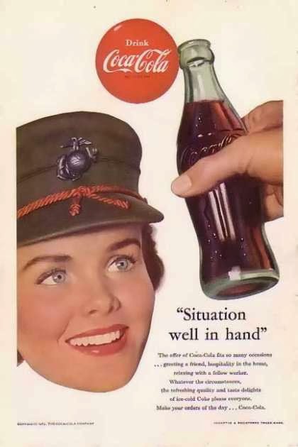
TASK: Coca-Cola feature
Research: 1950s Coca-Cola advertisements
Advertisements taken from: http://www.vintageadbrowser.com/coke-ads-1950s/4
My response:
What is an Editorial photograph?
As I am still slightly confused of the definitive meaning of an editorial image, I searched for the 'answer' and found a simple definition that has made it much clearer to me.
Editorial images illustrate and reflect the issues, themes, and events (both big and small) of our world today.
http://www.istockphoto.com/article_view.php?ID=1096
For me, this has reiterated that editorial photography can be of any genre and any subject, as long as it is not for commercial purposes.
Tips and tutorials
To get more of a feel of editorial photographer's practices, I looked into tips surrounding this and found '10 Practices Every Editorial Photographer Must Know'. The specific points that were the most informal and relevant to my editorial piece were as follows:
3. Shoot for the cover
If you're not a vertical shooter, get used to shooting verticals. Especially if you want to do magazine work. Typically magazines know what their feature story is for the publication so if you are shooting a part of the assignment, there's a fairly good chance you can land the cover. Make sure you leave space for the magazine header. Do this by avoiding busy backgrounds and keeping signage out of your shot.
If you're not used to shooting verticals, consider investing in a battery grip with a vertical release. It will help you make straighter shots.
4. Be more mindful of the details
There is only so much that can be done in post. Editorial art directors like smart, sharp images with straight lines and clean composition. Sometimes fixing crooked horizons in post can't fix it as well as just taking a step to the left or right.
5. Take a step back
Often photographers are in the habit of cropping in the camera. The difference with shooting for magazines is that the images often take up the entire page and need bleed room. You can avoid any images being thrown out by simply giving extra room along the sides. Take a step back before taking the shot. It might be hard to get used to, but remember extra space is needed for the bleed. You don't want your images to be unusable because you've shot too tight.
7. Take into consideration who you are shooting
By knowing your subject's profession or role in the story, you'll be able to capture them in a way that compliments the tone of the article. Your images of a comedian should not be shot in the same way as your images of a CEO.
With every photo, make the props, pose, outfit, and mood of your subject all match the overall message of the shoot.
Taken from: http://photography.tutsplus.com/tutorials/10-practices-every-editorial-photographer-must-know--photo-14450
Lighting
As this is something I need to get educated on, I have bought my own Bowens twin head studio kit to allow me to experiment and improve myself whilst at home. The kit came with two umbrellas which double up as reflectors if I remove the black covering, allowing me to choose between shoot-through - to diffuse the light for a softer appearance - or bounce - for more directional, focused light.
To better understand exactly what these gave in regards to the disposition of light, I looked to the internet for tutorials and lessons on how to achieve particular types of lighting. As most might say I may be restricted with just umbrellas and not soft boxes or any other modifiers, I took this as a challenge to understand what umbrellas can do in photography and shoot all my images for this module without looking to any other source that these and natural/available light.
http://www.photographycourses.biz/moody_home_studio_lighting_2.htmlhttp://www.lighting-essentials.com/shoot-thru-umbrella-and-bounce-umbrella-a-comparison/
Editorial article idea
After considering possible topics for my article, I have decided to focus my editorial piece on deafness and the stigma that surrounds hearing loss. This is because it is something I am passionate about, mostly a result of growing up in a household with profoundly deaf and hard of hearing parents.
I spoke in … person throughout the article, as to allow myself to talk about my own opinions without creating a 'character' to put these across, I felt that this way it read with more authenticity.
WHAT ARE FEATURES?
http://d24w6bsrhbeh9d.cloudfront.net/photo/aPvgxYQ_460sa.gif
http://www.psa-newmember.org/image_evaluation/pj_images/FeaturePhotographyandPJ.pdfMORALS/RIGHTS/SENSITIVITIES
http://www.the-aop.org/information/copyright-4-clients/faqs
RELEVANT RESEARCH
http://www.bbc.co.uk/news/world-africa-25330672
http://www.foxcrawl.com/2013/12/14/fake-deaf-and-dumb-translator-next-to-barack-obama-at-mandela-funeral-sign-language-interpreter-is-an-imposter-with-criminal-record/
http://limpingchicken.com/2013/12/17/deaf-news-scandal-of-deaf-man-treated-as-if-he-had-dementia-in-hospital/
http://en.wikipedia.org/wiki/Legal_recognition_of_sign_languages
ARTICLE SOURCES
http://www.tate.org.uk/art/artists/sir-joshua-reynolds-444
https://www.tate.org.uk/art/artworks/reynolds-self-portrait-as-a-deaf-man-n04505
My chosen final images
This brief was simply to create a feature for the Coca Cola brand. After conducting some initial research, I decided I wanted to follow the style of the vintage, pin up girl Coca-Cola ads from the 1950s. My subject was dressed in a fur coat with red headscarf and matching lipstick for a pop of colour. In keeping with this retro style, I (eventually!) came across and bought glass bottles of Coca-Cola, which I feel were paramount in making this look as genuinely vintage as possible. The lighting I used was a single shoot-through umbrella directly at my subject for soft light to flatter her skin, whilst using an aperture of f/5.0 to ensure that her face was in focus. In post-production I slightly increased the Clarity and used the Mask tool to increase exposure on the minor under-eye circles. In hindsight, I now know I would have improved the look of the image if I had removed the dietary information and reflection of light on the bottle which partly obstructs the view of the ‘Coca-Cola’ branding.
For the image of the bottle, I used a softbox above and another under the table to ensure the light was evenly spread across the bottle. I used an automatic extension tube with my 50mm f/1.4 to get as close as I wanted to the detail, whilst having an aperture of f/8.0 to ensure that the bottle top was pin sharp. In post-production, I again increased Clarity, sharpness and slightly increased the exposure. If I were to shoot this again I would have increased the strength of the lights used as I may not have needed my ISO to be as high as 800.
This image was used for the background of my editorial article
title. I wanted something of simple composition that clearly represented what
the theme of the piece would follow. I used a shoot-through umbrella and
extension tube to allow me to get closer to the subject’s hearing aid. I used
an aperture of f/7.1 to get part of the ear as sharp as possible – something I
feel that I struggled with – and an ISO of 1000 as I was finding it difficult
to get enough light onto the ear in order to retain focus. I deliberately shot
the ear using rule of thirds as to allow myself some negative space to use for
the article’s headline, which I accentuated with adding vignette effect. Other
post-production includes an increase in exposure, clarity and the Mask tool to
increase exposure on the middle of the hearing aid which was underexposed.
Although I am fairly happy with the final result, as I am not practiced in
macro photography or using studio lighting, I feel that these are both definite
things I need to work on.
As my editorial piece is of a simple style, my intentions for the
contributing images were to be the same. For this portrait I used a
shoot-through umbrella on continuous to flatter my subject and create a catch
light. I used an aperture of f/4.0 to ensure my subject was in focus but also
drop the background suitably out of focus, to make the deaf representation of
hands subtle and still visible. In post-production I slightly increased
exposure, Clarity and used the Mask tool to remove minor under-eye shadows. If
I were to shoot this image again, I would use a higher setting of my light as I
feel the subject was slightly underexposed.
For this image I again used a shoot-through umbrella to diffuse the
light but this time placed it at more of an angle to my subject, as to create
more dramatic shadows on the side of his face. In post-production, I increased
Clarity and used the Mask tool to expose parts of the subject’s face, his
hearing aid in particular, to create more of a contrasting effect.
In this image, I again placed the white umbrella at an angle to
create an attractive catch light effect and to create shadows on one side of
the subject’s face/head. I asked her to use the British Sign Language sign for
‘deaf’ and to smile to show her deaf pride. In post-production, I reduced the
shadows, increased the Clarity and used the Mask tool to slightly brighten the
left side of her face and hair.
In keeping with the same style as my previous portraits for my
editorial article, I again wanted a simple headshot, which has a subtle nod to
deafness. I again used a white, shoot-through umbrella to diffuse the light,
flatter my subject and create a catch light. I used an aperture of f/3.5 to
drop the background out of focus and asked my subject to slightly turn his head
to show off his hearing aid. In post-production, I used the Mask tool to make
this area brighter and more visible and also increased the Clarity.
My Editorial article
No comments:
Post a Comment